

I finally had time to take photos of the recent cards I created!
I was working on them before I went on a road trip over Labor Day to Kentucky to visit family. I just didn't get a chance to photo and blog them.
I'm happy to be back in the North where we don't have the humidity that they have in the South. It just about kills me, I hate it! I know we have humidity here in Minnesota, but nothing like they have there. Normally when we visit we either go in May, June or July when it's even worse. We had one day that we could tolerate and that was the first day we were there! Anyway, it was nice to see family.
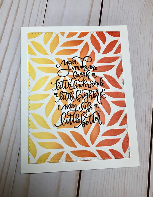
Moving on.....my first card the background was created blending distress oxide inks - fired brick, worn lipstick and fossilized amber. I then spritzed the background with water to get the droplets where the water reacted. The leaves are from a die called Outline Clustered Leaves from Simon Says Stamp. The sentiment is from a stamp set by Reversed Confetti called The Most Beauty.
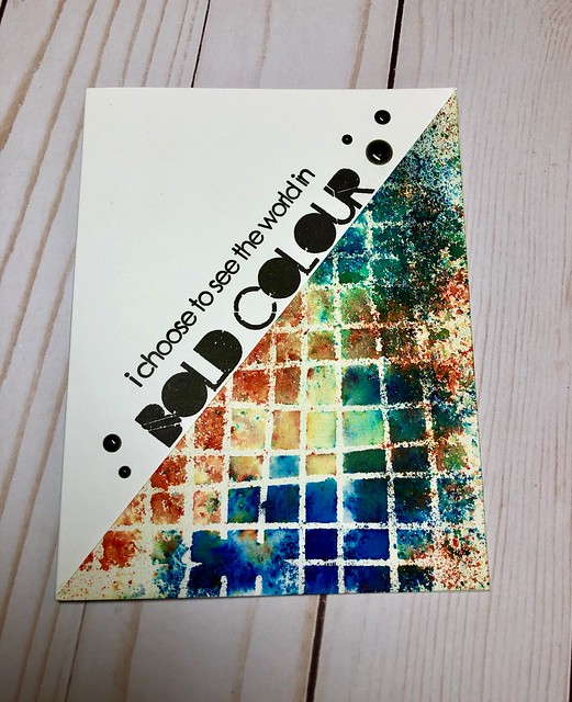
For the card above and below I used a stencil called Wonky Grid from Altenew.
I used Brusho Crystal Colours (which are similar to Ken Oliver's Color Burst). I used the colors gamboge, turquoise and cobalt blue. I laid my stencil down then sprinkled the power over the stencil and spritzed watered over it. I set a stamp block on top for a few minutes then lifted it. I cut the panel in two for two cards. The stamp used on the top card is called Bold Colour by Visibile Image. The sentiment used on the bottom card is from Simon Says Stamp called Handlettered Encouragement.


For the card about and below I used a stencil from Altenew called Ombre Stripes.
I applied distress oxide inks over the stencil on both. The colors used for the top card are cracked pistachio, salty ocean and blueprint sketch. For the card below I used blueprint sketch, hickory smoke and wilted violet. After I blended the inks I spritzed both cards with water to get the inks to react.
The top card uses a sentiment from Visible Image called So Much Stronger. The card below uses a stamp for Gina K Designs called Lettered and Lovely.

For my last card I used a stencil from Gina K Designs that I applied distress oxide ink through. The colors I used are fossilized amber, ripe persimmon and candied apple. I die cut my panel using a die called double stitched rectangles from Our Daily Bread (they've changed their name to Divinity Designs LLC now). The sentiment is from Gina K Stamps called Lettered and Lovely.

I am working my way through the pile above. I'm basically just deciding what sentiments to use on them. I may decide at last minute to add stenciling, embossing paste or die cut into flowers......the possibilities are endless...... I'm trying to keep the pretty clean and simple.
I've been working on the details for a crop I'm hosting the end of October/beginning of November. This will be our second year going to this particular retreat. It's always so fun to get together with others for three nights. I never get anything done, but that's okay! I hope we keep going year after year. The place is always booked so you reserve it a year in advance.
This year I'm going to be doing a very casual card class. So, I'm thinking of ideas so that I can make a few sample cards for them look at. We'll be doing watercolor, stencils, paste etc so all cards will turn out different.
We also have one of the ladies doing a Chalk Couture class, so that will be fun. I took her class back in April and loved it!
That's it for now! Thanks for stopping by!
2 comments:
great cards....nice array of colours and layouts.
:) Karen
I love all of these!
Post a Comment